The new Human Native brand identity
Harry Richards · Product Designer
14 April 2025

Human Native exists to help AI companies access high-quality, rights-cleared content from rights holders for fair compensation.
We've come a long way in a short period of time, and as the company evolves, so must our brand. With a core founding team in place, it was the right time to reflect on our identity. Our objective was to reimagine how we communicate Human Native’s products, services and experiences. In this article, we’ll share some insights from our process and the key elements that shape our new brand identity.
Brand positioning
We began by aligning the perspectives of Human Native’s most valuable asset—the people. As members of our founding team, their views are invaluable in shaping the future of the company. We interviewed each member to capture their unique perspectives. The findings were compelling and remarkably consistent. What excited us most was the strong alignment in how we all think and feel about the company and the opportunity to help rights holders and AI developers already. From these conversations, we defined a clear positioning using language shared by the team:
Our definition: what we do
We enable the exchange of premium, high-quality data through a secure and transparent licensing platform.
Our mission: why we exist
We’re creating a fair data ecosystem that ensures equitable compensation for rights holders while enabling responsible AI development.
Our vision: where we’re going
To become the trusted facilitator of the AI economy, building a sustainable ecosystem where data drives equitable value creation.
Logo & Symbol
The only element we retained from our original brand was our name—Human Native. It perfectly captures our essence: AI optimists, on the side of humans. We wanted our logo to have the same impact. Using a serif typeface with tightened letter spacing for cohesion, the Human Native logo feels instantly familiar yet undeniably unique—a straightforward wordmark that serves a key purpose for any early-stage business: providing a clear and memorable name.

The symbol represents the most minimal expression of Human Native. We aimed for something unique where the shape gives viewers freedom to interpret its meaning. Reminiscent of a capital 'H' and inspired by incrementing variables in code, the symbol reflects two corresponding plus signs united to form a single, harmonious shape. This represents positivity, growth, and how we are pursuing the win-win in AI data licensing.

Typography
Typography is often seen as purely functional rather than emotional—especially in the tech industry, where many startups rely on trending sans serif fonts without fully considering their expressive potential.
We decided to select a typography pairing that does more than just put words on a page. We loved the typeface in our logo so much that we adopted it as our display typography. Orbikular, as it’s known, is a timeless serif that bridges the gap between Transitional and Scotch Roman styles. We paired it with Geist, offering a clean, modern aesthetic specifically designed for developers and designers, drawing inspiration from the renowned Swiss design movement.
Together, they deliver everything we wanted from our typography: a branded experience with a human touch that balances tradition and innovation.
Colour
Our core brand colours represent the balance between human connection and positive innovation. We created a set rather than relying on one definitive hex code. These come in four high-contrast styles inspired by the natural world: green, mint, teal, and blue—all of which can be used interchangeably. As Pablo Picasso famously said: "Colour, like features, follow the changes of the emotions." We purposefully chose colours with corresponding hues, saturation, and light to give them a unified yet distinct commonality. Silver adds refinement, while white and black maintain contrast and legibility, ensuring an elegant, minimal aesthetic.

Our secondary colours draw inspiration from data visualisation, symbolising clarity and the interaction between people and technology. These vibrant hues add dynamic energy, complementing our primary colours when used for highlights and accent elements.

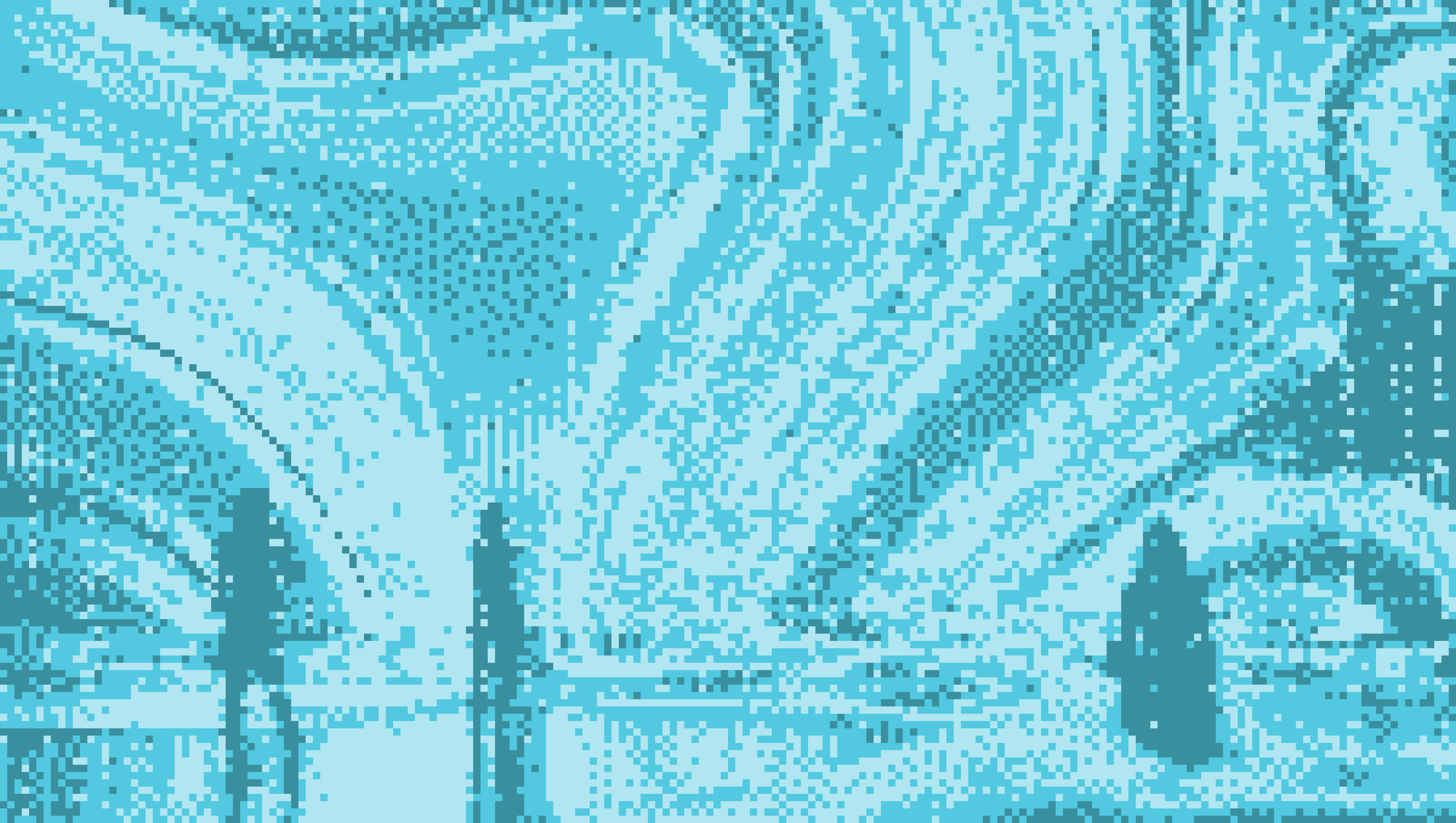
Imagery
Understanding your audience is crucial for branding success. A challenge for us is that we have two distinct audiences: rights holders and AI companies. While different in makeup, they share a common connection—rights holders produce the content that AI companies rely on for the data behind their models. Aligning with our mission, we drew inspiration from this connection to shape our imagery.
We achieved this using a digital processing effect called dithering, which introduces a structured, pixelated effect to images, representing the transformation and exchange of creative works. The original images come from art galleries and installations. Drawing inspiration from these spaces emphasises our commitment to presenting value, sparking meaningful connections, and nurturing creativity within a community. To complete the process, we map the colours in the images using three shades of a single brand colour.
Bringing it all together
We're excited to share our vision for the future of Human Native. We hope you like it as much as we do. As a team, we've reached a pivotal moment in our journey, and this rebrand reflects our growth while guiding us forward. As our brand evolves we'll continue to share more, while staying committed to our vision of becoming the trusted facilitator of the AI economy.
We try to apply this same, thoughtful analytical process to all the work we do. If you're interested in joining, please check out our open roles.
If you're a rights holder or AI developer, and want to begin your fair licensing journey, get started here.